Back to the Basics: Black and White
DU magazine illustrator details the transition to black and white for Last Call column
DU magazine illustrator details the transition to black and white for Last Call column
"We all have 10,000 bad drawings in us. The sooner we get them out the better." -Walt Stanchfield
I think it's safe to say that most artists begin their artistic journey with the most basic of mediums, paper and pencil.
Unfortunately, as many artists develop and mature, these common tools are often left behind, demoted to simply capturing ideas or developing compositions for more "serious" work.
So, I was thrilled when the editors at Ducks Unlimited suggested that I illustrate Doug Larsen's Last Call column with pencil.
I've grown to appreciate pencil work. A sensitive and well-executed drawing has all of the elements of every other art form... except, of course, for color.
And for me, that's the interesting aspect of drawings. As in black-and-white photography, working with the absence of color requires a hypersensitivity to values, the range of lights and darks throughout the composition. While artists working with color often use a shift in chroma to define a space, or the edge of an object, those working without it are faced with more difficult challenges. I find the solutions to these problemsvery interesting and appealing.
One thing I look for in a well-managed drawing is the absence of outlines and a sense that the drawing was "painted" with pencils.

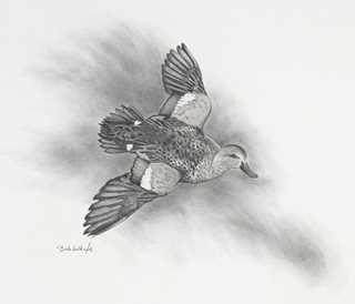
"Blue-winged Teal" - pencil on archival paper - used to illustrate Doug Larsen's Last Call column in Ducks Unlimited.
I enjoy drawings that allow light to infuse the image. In other words, the white space of the paper is invited into the composition by avoiding an outline.

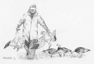
"Two Snows Down" - pencil on archival paper - used to illustrate Doug Larsen's Last Call column in Ducks Unlimited.
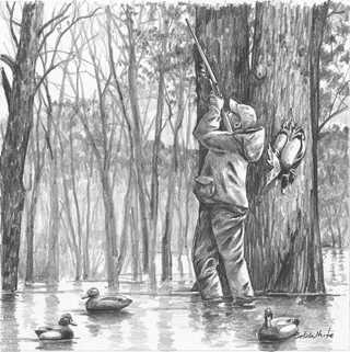
While I value a perfectly blended passage in pencil, I particularly appreciate the marks of pressure and relief left behind by the artist. I think of these as "sacred marks" and value them in much the same way that I do brush strokes in
a painting. Note the simple marks that designate the rough bark of the oak trees.

"Flooded Timber Hunt" - pencil on archival paper - used to illustrate Doug Larsen's Last Call column in Ducks Unlimited.
I find a simple elegance in grayscale, or black-and-white renderings. I'm drawn to them because, without color, I feel that my mind and imagination are engaged on a more basic and deeper level. In much the same manner that impressionistic paintings allow the viewer to "complete" the image in one's mind, a black-and-white impression engages my imagination and invites me to look at the world differently. A successful drawing evokes a sense of color in my mind's eye.
While I produce my grayscale images with graphite and pen and ink, there are a myriad of ways that such images can be rendered.
Other techniques used to create black-and-white art:
- Drawings on a light background are executed in charcoal, graphite, metal point (the essential metals used are lead, tin and silver) or ink. Some artists work with a light mark on a tinted or dark background.
- Prints are produced in a multitude of methods, including woodcuts, engravings, etchings, drypoint, and lithography.
- Scratchboards are a form of direct engraving where the artist scratches off dark ink to reveal a white or colored layer beneath.
Ducks Unlimited uses cookies to enhance your browsing experience, optimize site functionality, analyze traffic, and deliver personalized advertising through third parties. By continuing to use this site, you agree to our use of cookies. View Privacy Policy